The Bodleian Libraries are a part of Oxford University and it is comprised of approximately 40 collections that are crucial to the history of Oxford. I divided the collections into five categories: main, business/law, science, health care, and education/culture. Through the re-categorization of the collections, visitors and members would be able to navigate through the libraries with more ease. For the logo, I kept the tradition of the libraries with an homage to Oxford University’s coat of arms.
When George Lucas first took over the Star Wars saga, many anticipated it to be magnificent—and it was. Since then, the Star Wars franchise has now become a multi-billion dollar industry. The Making of Episode I: The Phantom Menace captured the energy on the sets of the making of the first of the series of the prequel to the original Star Wars. For the fans who regard the series as a religion, I felt that the design of the original book did not do it justice. I decided to separate the images from the text and did not crop out any of the details of the images. This increases the value of the work that was put into the movie. I also included a part of The Odyssey by Homer, which was the main inspiration for the original Star Wars.
Alaska Airlines is based in Seattle, Washington. What started out as an airline with only one single-engine, three-passenger aircraft has now grown into an international carrier with 155 fleets and 104 international destinations.
For the new identity, I referenced the Willow Ptarmigan, which is the state bird. The Ptarmigan is native to Alaska and is distinctive because of its red eyebrow. Red also became the main color for the new identity. The symbol mimics the shape of the bird and also reflects the shape of an airplane and the elegance of flight.
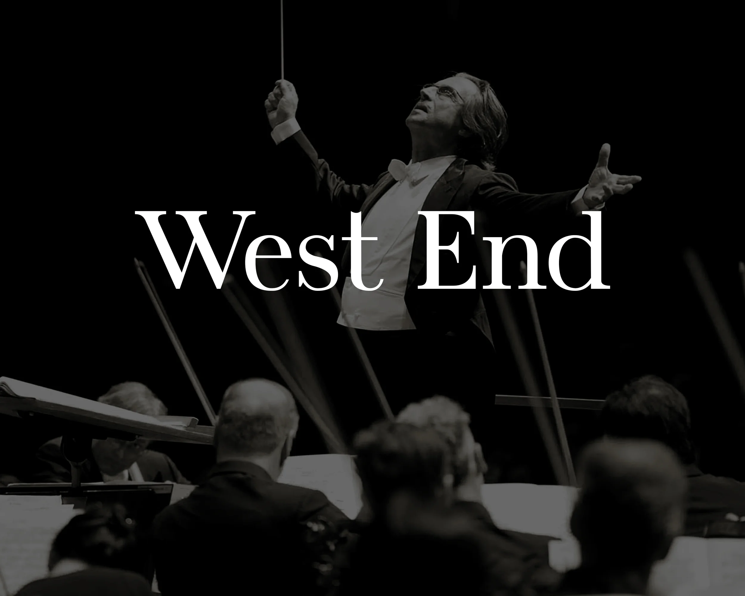
West End was originally inspired by modern typefaces such as Didot and Bodoni, and it was meant to be used as a display typeface for lifestyle editorial pieces.
Go Metric! is a campaign that encourages Americans to officially start the process of metrification.
Go Metric! is targeted towards designers and printers by using the A-paper system as an example. The brochure explains how convenient and useful it is to use the measurement system that is used by the rest of the world. The time is now: America, let's go metric!
The Space Race is an information design project where I organized the history of the Space Race into two parts, the Russian side and the American side.
The inner columns contain all the information about the spaceships that were sent out during the space race as the two countries were constantly trying to one-up each other. The outer columns show the general history that occurred during this frenzy.
Bullet Proof is a hand lettering project that turned into a 70" x 40" throw blanket. It was nice to see how design flourishes when it is scaled and made into an object. I drew inspiration from Western typography as well as typography from Quentin Tarantino films.